1. First level analysis - overview
Now that the functional data has been preprocessed, we can fit a model to the data. To understand how model fitting works, we need to review some fundamentals such as the General Linear Model, the BOLD response, and what a time-series is. If you have followed the lecture, you can skip the thoretical part and start directly with the practicals.
1.1. The Time-Series
To understanding how model fitting works, first we need to review the structure of fMRI data. Remember that fMRI datasets contain several volumes strung together like beads on a string; we call this concatenated string of volumes a run of data. The signal that is measured at each voxel across the entire run is called a time-series. It follows that there are as many time-series as there are voxels in your dataset.
Note
In SPM, a run is called a session. Some terms have not been standardized across the analysis packages, but for the purporses of this course I will continue with the above definition of a run.
1.2. The BOLD signal
Deoxygenated blood leads to a decrease in the signal measured from a brain region. An increase in oxygenated blood, on the other hand, increases the signal - and this increase in oxygenated blood is correlated with increased neural firing. This change in signal is known as blood oxygen level dependent signal (or BOLD signal).
If fMRI, the BOLD signal is be used as an indirect measure of neural activity. A experiment by Kwong et al. consisted of alternately showing a flashing checkerboard and a black screen to the subject for one minute each. The BOLD signal was recorded during each condition, as shown in the following video:

1.2.1. The BOLD Signal as an Indirect Measure of Neural Firing
Although the discoveries of Ogawa and Kwong were a boon for neuroimagers using MRI, there was a catch: This new method was an indirect measure of brain activity, a few steps removed from the actual neural firing. Whenever a stimulus is presented - such as a flash of light, or a sudden noise - that stimulus is transduced by the sensory organs into nerve impulses, which in turn stimulate neuronal firing in the brain. Neurons that fire require oxygen, and oxygen is delivered by the blood. That oxygenated blood in turn increases the signal from nearby hydrogen in the water in your body, which is what is measured in the scanner.
Nevertheless, this is the measure used to infer whether a given region of the brain is “active” or not. And to make those inferences, we will need to take a closer look at the BOLD signal, experimental designs, and how we integrate the two with mathematical models.
1.3. The Hemodynamic Response Function (HRF)
1.3.1. From the BOLD Response to the HRF
In the previous chapter you read about a number of assumptions that are made about what the BOLD signal represents; another assumption we make is what the BOLD response looks like. This is important not only for modeling the link between neural activity and blood flow, and from there to the observed signal, but for how we define a model to test which brain regions show a significant change in their BOLD response to a given stimulus.
In the 1990’s, empirical studies of the BOLD signal demonstrated that, after a stimulus was presented to the subject, any part of the brain responsive to that stimulus - say, the visual cortex in response to a visual stimulus - showed an increase in BOLD signal. The BOLD signal also appeared to follow a consistent shape, peaking around six seconds and then falling back to baseline over the next several seconds. This shape can be modeled with a mathematical function called a Gamma Distribution. When the Gamma Distribution is created with parameters to best fit the BOLD response observed by the majority of empirical studies, we refer to it as the canonical Hemodynamic Response Function, or HRF.
When applied to fMRI data, the Gamma Distribution is called a basis function. We call it a basis function because it is the fundamental element, or basis, of the model we will create and fit to the time series of the data. Furthermore, if we know what the shape of the distribution looks like in response to a very brief stimulus, we can predict what it should look like in response to stimuli of varying durations, as well as any combination of stimuli presented over time. We now turn to illustrations of each case.
1.3.1.1. The HRF for a Single Impulse Stimulus
If the duration of a stimulus is very short, such as a snap of the fingers, we can say that it is an impulse stimulus - in other words, it has no duration. As you can see in the following figure, the shape of the BOLD signal looks like a typical Gamma Distribution, with a peak close to the beginning of the time axis (i.e., the x-axis) and a long tail to the right.
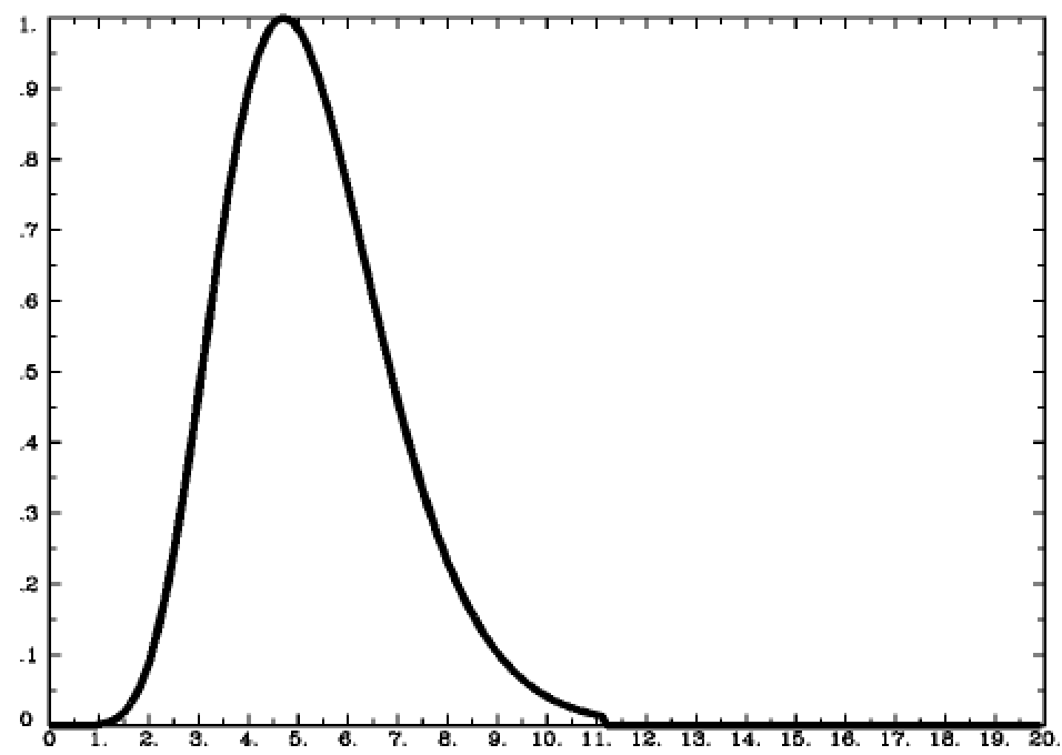
The HRF generated by a single impulse stimulus. In this figure, the stimulus occurs at timepoint 0 on the x-axis.
1.3.1.2. The HRF for a Single Boxcar Stimulus
Although many studies use stimuli lasting only a second or less, some studies present stimuli for longer periods of time. For example, imagine that the subject looks at a flashing checkerboard for fifteen seconds. In this case the shape of the HRF will be more spread out with a sustained peak proportional to the duration of the stimulus, falling back to baseline only after the stimulus has ended. This stimulus is called a boxcar stimulus, because it looks like a boxcar on a train.
In this case the Gamma Distribution is convolved with the boxcar stimulus. Convolution is the averaging of two functions over time; as a result, the Gamma Distribution broadens as it is averaged with the boxcar stimulus, and returns to baseline when the stimulus is removed.
Note
In the Single Impulse case, the Gamma Distribution is also convolved with a stimulus. Since an impulse stimulus is infinitesimally small, it is represented as a vertical line on the time axis. This is why it is sometimes called a stick function.
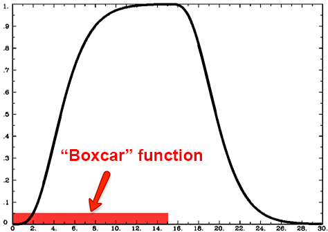
Illustration of the HRF generated by a boxcar stimulus lasting for fifteen seconds. Note that the BOLD signal begins descending back to baseline around the fifteen-second mark.
1.3.1.3. What if the HRFs overlap?
We have seen what the BOLD signal looks like after a stimulus is presented and how the HRF models the shape of that signal. But what happens if another stimulus is presented before the BOLD response for the previous stimulus has returned to baseline?
In that case, the individual HRFs are summed together. This creates a BOLD response that is a moving average of the individual HRFs, and the shape of the BOLD signal becomes more complex as more stimuli are presented close together.
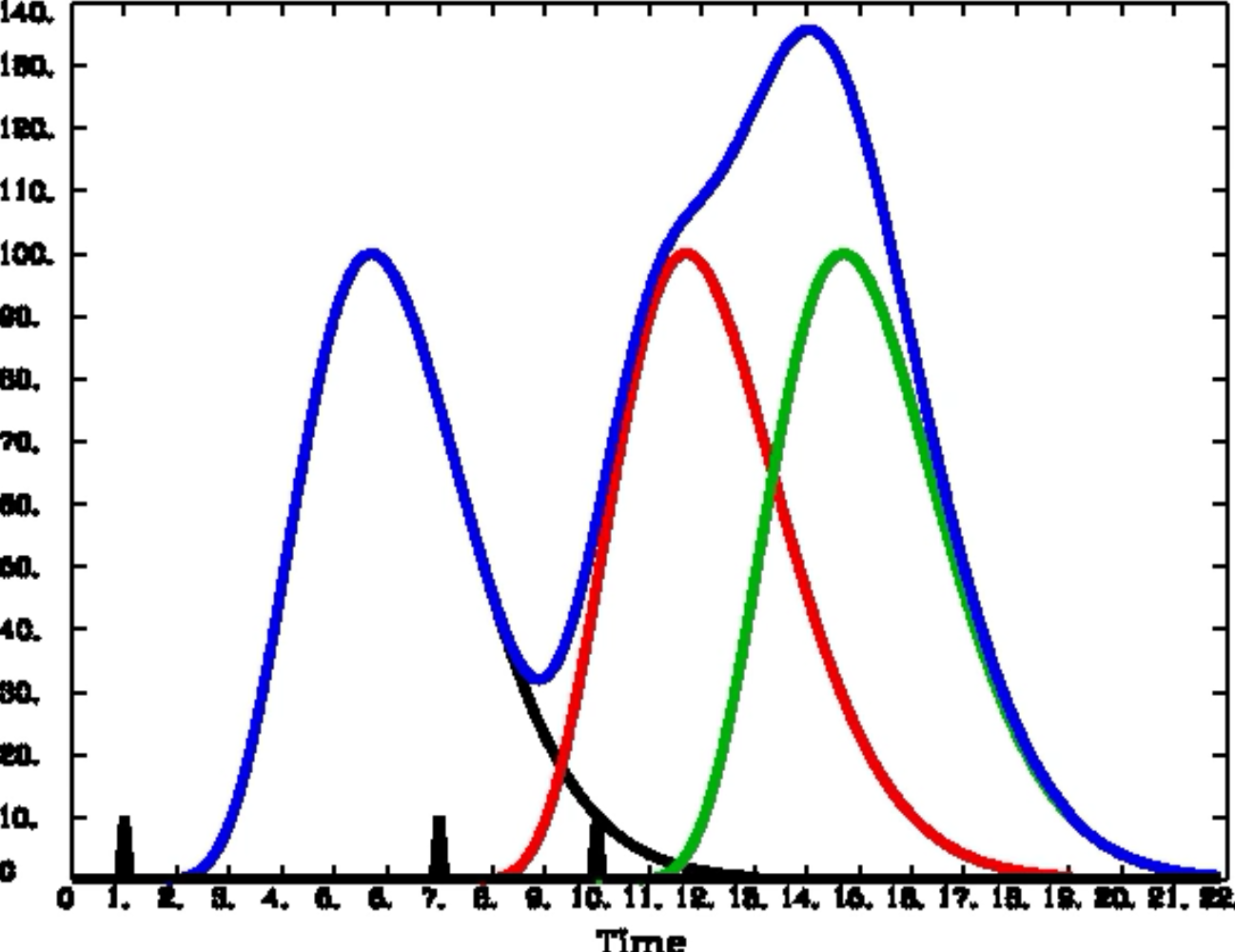
Convolution of the HRFs for individual stimuli. The overall BOLD response (blue) is a moving average of the individual HRFs outlined in black, red, and green. The vertical black lines on the x-axis represent impulse stimuli. Figure created by Bob Cox of AFNI.
1.3.2. Putting it all together: Animations of each Case
To help you understand what you have just read, watch the following animation a couple of times. It will show how each of the cases described above unfolds over time, which will aid your comprehension.

Animations originally created by Bob Cox of AFNI.
1.3.3. Exercises
Use this applet to practice convolving different shapes together. To replicate the convolution of the impulse function with the HRF, for example, set the input signal to “Dirac impulse” and the output signal to “custom,” and trace out the shape of a gamma function with your mouse. Also try setting the input signal to “Rectangle,” and try both widening and narrowing the shape.
Note
The concepts you have just learned are probably more difficult to understand than what you have learned previously in this course. Even if you don’t feel that you fully understand the HRF and convolution, go on with the rest of the module. After you have read the remaining chapters and have done the practical exercises, come back to this chapter and then see if it makes more sense.